


Each year the Pantone Color Institute announces a Colour of the Year, and in 2026 the choice is something truly different and inspiring.
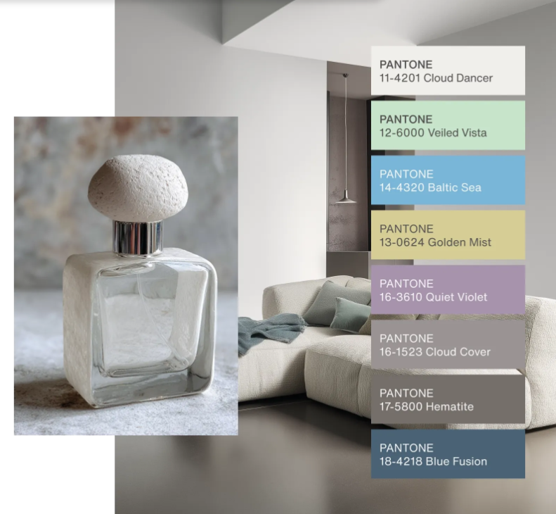
For the first time, Pantone selected a shade of white as its Color of the Year — PANTONE 11-4201 Cloud Dancer. This “billowy, calming white” evokes clarity, serenity, and quiet renewal in a world that has spent recent years confronting noise, distraction, and change.
Cloud Dancer isn’t a stark, clinical white. It’s an off-white with subtle warmth and balance that makes it incredibly versatile in interiors — offering a fresh, airy backdrop that works with almost any style or palette.
What Cloud Dancer Means for Your Home
Pantone describes the 2026 Color of the Year as a colour that creates space for calm and clarity — like a fresh canvas ready for creativity and new beginnings.
Here’s how to incorporate this serene shade into your home:
1. Start With the Walls
Cloud Dancer is perfect for painting walls when you want a neutral base with depth. It’s not pure bright white — it has soft undertones that help:
-
Reflect natural light
-
Make rooms feel larger
-
Create a consistent backdrop for décor
Pair it with richer accent colours like navy, charcoal, or earthy tones for contrast.
2. Blend With Textures
Because it’s neutral, Cloud Dancer lets textures shine. Try:
-
Linen curtains
-
Wool or boucle upholstery
-
Natural wood elements
These textures give warmth and character while keeping the space light.
3. Accent with Colour
Cloud Dancer pairs beautifully with almost any colour palette:
-
Powdered pastels for a soft, calming feel
-
Deep jewel tones for a dramatic touch
-
Warm neutrals like taupe and cream for cozy elegance
This makes it ideal if you love seasonal décor updates without repainting.
4. Bedrooms & Bathrooms
Its gentle, airy feel makes Cloud Dancer a perfect choice in restful spaces:
-
Bedrooms feel tranquil and open
-
Bathrooms feel spa-like when paired with natural stone or matte black fixtures
5. Art & Decor Stand Out
Because it’s a soft neutral, Cloud Dancer lets other elements take centre stage:
-
Bold artwork
-
Patterned rugs
-
Sculptural lighting
Use it as a backdrop to anchor and elevate your favourite pieces.
Why Designers Love Cloud Dancer
Pantone’s choice reflects a broader design trend toward calm, intentional living spaces — environments that don’t overwhelm the senses but instead provide a place to recharge and reset.
White has always been a staple in interior design, but this specific shade allows for balance and harmony without feeling stark or cold.
Quick Tips Before You Paint
✔ Test samples in different lighting — Cloud Dancer can read slightly warmer or cooler depending on sun exposure.
✔ Keep surrounding finishes (flooring, trim, cabinetry) in mind — they’ll influence how the hue looks.
✔ Start with small spaces — like an entryway or powder room — before committing to a whole home.
Pantone’s Cloud Dancer isn’t just a trend — it’s a reminder that sometimes the most impactful design choice is one that brings peace and clarity to your everyday life.


